


Mobile optimization is no longer optional—it is essential for survival in the digital age. With a staggering 69.6% of total internet traffic coming from mobile devices, businesses must adapt or risk falling behind. But here’s the twist: most websites are failing to meet mobile users’ expectations. All that effort in getting clicks means little if your visitors cannot navigate your site quickly. By prioritizing mobile SEO best practices, you can not only improve your search rankings but also significantly enhance user experience, turning casual visitors into loyal customers.
Table of Contents
- Ensure Your Site Is Mobile-Friendly
- Optimize For Mobile Site Speed
- Improve Mobile User Experience
- Structure Your Mobile Content
Quick Summary
| Takeaway | Explanation |
|---|---|
| Responsive Design is Essential | A responsive website adapts seamlessly to different devices, crucial for user experience and search engine rankings since Google prioritizes mobile-friendly sites. |
| Optimize Mobile Site Speed | Speed is critical; 53% of users abandon sites that take longer than three seconds to load. Effective strategies include image compression, caching, and using CDNs. |
| Focus on Mobile User Experience | Prioritize mobile-first design with simplified navigation, legible typography, and touch-friendly elements to engage and retain users. |
| Content Structure Matters | Content should be concise and scannable, utilizing short paragraphs, bullet points, and effective visual hierarchy to facilitate quick information retrieval on mobile devices. |
| Integrate Interactive Elements | Incorporating multimedia such as videos, infographics, and interactive sections improves engagement, transforming passive viewing into immersive experiences. |
Ensure Your Site Is Mobile-Friendly
In the digital landscape of South Africa, mobile optimization isn’t just a recommendation—it’s a critical necessity. With mobile devices dominating internet traffic at an astounding 69.6% of total internet usage, businesses cannot afford to ignore mobile SEO best practices.
Responsive Design: The Foundation of Mobile SEO
A responsive website adapts seamlessly across different screen sizes and devices, providing an optimal user experience. This means your site’s layout, images, and functionality should look and work perfectly whether viewed on a smartphone, tablet, or desktop. Google’s mobile-first indexing prioritizes mobile-friendly websites, making responsive design crucial for search engine rankings.
Key elements of a responsive design include:
- Fluid grid layouts that scale proportionally
- Flexible images that resize without losing quality
- Media queries that adjust content presentation based on device characteristics
Performance Optimization for Mobile Devices
Mobile SEO strategies must prioritize site speed and performance. Research shows that 89.28% of South African internet traffic comes from mobile devices, meaning slow-loading websites can quickly lose potential customers.
To enhance mobile performance, consider:
- Compressing images and multimedia content
- Minimizing server response times
- Leveraging browser caching
- Eliminating render-blocking JavaScript and CSS
Core Web Vitals and Mobile User Experience
Google’s Core Web Vitals are critical metrics that directly impact mobile SEO rankings. These metrics measure loading performance, interactivity, and visual stability. Neglecting these factors is considered a top SEO mistake in 2025, potentially causing significant ranking drops.
To excel in Core Web Vitals, focus on:
- Largest Contentful Paint (LCP): Ensure main content loads within 2.5 seconds
- First Input Delay (FID): Maintain interactivity within 100 milliseconds
- Cumulative Layout Shift (CLS): Keep unexpected layout shifts minimal
By implementing these mobile SEO best practices, you’ll not only improve search engine rankings but also provide a superior user experience that converts visitors into customers. Remember, in today’s mobile-first world, your website’s mobile performance can make or break your digital success.
Optimize for Mobile Site Speed
In the hyper-competitive digital landscape of South Africa, mobile site speed isn’t just a technical detail—it’s a make-or-break factor for online success. A remarkable 53% of mobile users abandon a site if it takes longer than three seconds to load, which translates directly into lost opportunities and potential revenue.
Technical Foundations of Mobile Speed Optimization
Optimizing mobile site speed requires a multifaceted approach targeting various technical aspects of website performance. Implementing next-generation image formats like WebP, enabling lazy loading, minifying resources, and configuring appropriate caching headers are critical steps for improving mobile site performance.
Specific technical strategies include:
- Image Compression: Reduce file sizes without compromising visual quality
- Browser Caching: Store static resources locally to minimize repeat downloads
- Minification: Remove unnecessary characters from code without changing functionality
- Content Delivery Networks (CDNs): Distribute website content across multiple servers globally
Performance Metrics and User Experience
Understanding performance metrics is crucial for effective mobile optimization. Research indicates that a mere 1-second improvement in mobile page load time can deliver a 2.5× higher conversion rate, underscoring the direct correlation between speed and business outcomes.

Key performance indicators to monitor include:
- First Contentful Paint (FCP): Time taken for first content to appear
- Time to Interactive (TTI): Duration before page becomes fully interactive
- Total Blocking Time (TBT): Measures responsiveness during page load
Mobile Speed Optimization Tools and Techniques
Leveraging advanced tools and techniques can dramatically enhance mobile site speed. Google’s PageSpeed Insights, Chrome DevTools, and specialized mobile performance analyzers provide granular insights into optimization opportunities.
Recommended optimization techniques include:
- Implementing AMP (Accelerated Mobile Pages) for lightning-fast loading
- Using progressive web app (PWA) technologies
- Prioritizing above-the-fold content loading
- Eliminating render-blocking JavaScript and CSS
By meticulously addressing mobile site speed, businesses can create seamless user experiences that not only retain visitors but also significantly improve search engine rankings. In the mobile-first era, speed isn’t just an advantage—it’s a fundamental requirement for digital success.
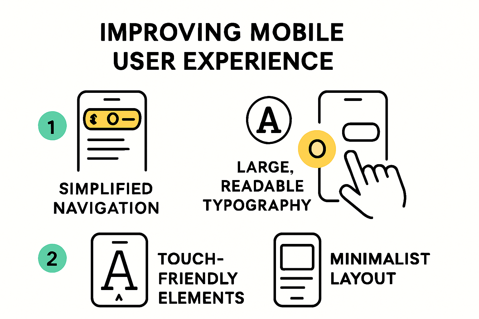
Improve Mobile User Experience
In South Africa’s digital ecosystem, mobile user experience is no longer a luxury—it’s a fundamental requirement for online success. With 89.28% of internet traffic originating from mobile devices, businesses must prioritize creating seamless, intuitive mobile interactions that engage and retain users.
Design for Mobile-First Interactions
Mobile-first design goes beyond responsive layouts—it’s about reimagining user interactions for smaller screens. Implementing mobile-friendly features like streamlined navigation, click-to-call buttons, and location-based services can significantly reduce bounce rates and encourage longer site visits.
Key design considerations include:
- Simplified Navigation: Use clear, touch-friendly menus
- Large, Readable Typography: Ensure text is legible without zooming
- Touch-Friendly Elements: Design buttons and links with adequate spacing
- Minimalist Layout: Remove unnecessary elements that clutter mobile screens

Content Optimization for Mobile Consumption
Content consumption differs dramatically on mobile devices. Users seek quick, scannable information that delivers value instantly. This means restructuring content to be more digestible and engaging on smaller screens.
Effective mobile content strategies involve:
- Breaking text into shorter paragraphs
- Using descriptive subheadings
- Incorporating bullet points and numbered lists
- Utilizing visual content like infographics and short videos
- Ensuring key information appears above the fold
Accessibility and Interactive Elements
True mobile user experience extends beyond visual design to include comprehensive accessibility and interactive functionality. Integrating mobile-friendly features that enhance user engagement is crucial for improving SEO rankings in South Africa.
Consider implementing:
- Voice Search Optimization: Enable natural language search capabilities
- Autofill Forms: Reduce manual input friction
- Gesture-Based Navigation: Support swipe and pinch interactions
- Offline Functionality: Allow basic site interactions without constant connectivity
By crafting a holistic mobile user experience that prioritizes speed, design, and intuitive interactions, businesses can transform casual visitors into engaged users. Remember, in the mobile-first landscape, every interaction is an opportunity to connect, convert, and build lasting digital relationships.
Structure Your Mobile Content
In the mobile-dominated digital landscape of South Africa, content structure is a critical factor for engaging users and optimizing search performance. With mobile devices accounting for 69.6% of internet usage, businesses must strategically craft content that resonates with mobile audiences’ unique consumption habits.
Concise and Scannable Content Architecture
Mobile users demand information quickly and efficiently. This requires a radical departure from traditional desktop-oriented content formats, focusing instead on bite-sized, easily digestible information that captures attention instantly.
Key principles for mobile content structuring include:
- Paragraph Length: Limit paragraphs to 2-3 sentences
- Subheadings: Use descriptive, short headings
- Bullet Points: Break complex information into scannable lists
- White Space: Incorporate generous margins to prevent visual clutter
Visual Hierarchy and Readability
Designing content with a clear visual hierarchy ensures that mobile users can navigate and understand information effortlessly. Effective mobile content relies on clean visuals and reliable internal linking strategies, which guide users through your digital ecosystem.
Strategies to enhance visual hierarchy include:
- Using contrasting font sizes
- Implementing bold typography for key points
- Integrating relevant, compressed images
- Creating clear typographic distinctions between headings and body text
Interactive and Multimedia Content Integration
Mobile content should transcend traditional text-based formats, incorporating interactive and multimedia elements that enhance user engagement. This approach transforms passive reading into an immersive experience.
Recommended multimedia integration techniques:
- Embedded Video Content: Short, informative video clips
- Infographics: Data visualizations optimized for mobile screens
- Interactive Elements: Clickable accordions and expandable sections
- Audio Snippets: Podcast-style content summaries
By meticulously structuring mobile content, businesses can create compelling digital experiences that not only capture user attention but also improve search engine visibility. Remember, in the mobile-first world, how you present information is just as crucial as the information itself.
Frequently Asked Questions
What are the key mobile SEO best practices for 2025?
Mobile SEO best practices for 2025 include ensuring your site is mobile-friendly with responsive design, optimizing site speed, focusing on mobile user experience, and structuring content for easy readability on mobile devices.
How does mobile site speed affect user experience?
Mobile site speed significantly impacts user experience; research shows that 53% of mobile users abandon sites that take longer than three seconds to load. Improving speed can lead to higher engagement and conversion rates.
What are Core Web Vitals and why are they important for mobile SEO?
Core Web Vitals are critical performance metrics that Google uses to measure loading speed, interactivity, and visual stability. Optimizing for these factors is essential for improving search rankings and providing a better mobile user experience.
How can I improve the mobile user experience on my website?
To improve mobile user experience, focus on mobile-first design principles like simplified navigation, large, readable typography, touch-friendly interactive elements, and ensuring that content is easily scannable and accessible.
Elevate Your Mobile SEO Game with SEO Studio
Are you still struggling to achieve optimal mobile performance and user experience as outlined in our detailed guide on Mobile SEO Best Practices for 2025? You’re not alone—many South African businesses face the challenge of turning mobile visitors into loyal customers. With an overwhelming 69.6% of total internet traffic coming from mobile devices, your website’s mobile speed and responsiveness can make or break your digital success.

Now is the time to act! At SEO Studio, we specialize in tailored SEO strategies that address these pain points head-on. Our services, including comprehensive website optimization, keyword research, and technical fixes, focus on enhancing your mobile site’s performance, ensuring you never miss out on potential clients. With our proven track record and glowing client testimonials, we’re here to turn your website into a powerhouse for organic traffic without the reliance on costly ads.
Don’t let your competitors outpace you! Visit https://seostudio.co.za today to learn how we can boost your rankings and elevate your mobile user experience now!

